Do you have your tickets yet?

Don't miss the most exciting art party in Tribeca and one of the best "see and be (in the) scene" events in New York!


The Tribeca Ball - a spectacular night of artmaking, artwatching and artcelebrating - is held on all six floors of the Academy and helps to provide students with scholarships, studio space and a program of varied and intense studies. It's a wonderful and exciting way to be a supporter of one of the most unique schools in the country and we'd love you to come!

Artists' Talk: Yu Hong and Liu Xiaodong

Monday, March 28, 2011, 6:00pm

Yu Hong, Colorful world
Yu Hong, Colorful World, 1992, 70x71 in.,  oil on canvas
Join us for a very special visit from preeminent Chinese artists Yu Hong and Liu Xiaodong. They will present a lecture on their work with curator and translator Michelle Loh.

The husband and wife pair both teach at the Central Academy in Beijing and have shown their individual artworks across the globe, with a recent solo exhibitions at Mary Boone Gallery in New York (Liu Xiaodong) and Guangdong Museum of Art (Yu Hong). Liu Xiaodong’s work is in public collections including the Museum of Fine Arts, Boston; Shanghai Art Museum, China and SF MoMA. Yu Hong’s work is in public collections including the Ludwig Gallery, Germany; the Dong Yu Art Museum, China and the Singapore Art Museum, Singapore.

Liu Xiaodong, Hot bed no. 1 (+ 4 others; set of 5)
Liu Xiaodong, Hot Bed No. 1 (+4 others; set of 5), 102x393 in., oil on canvas

Michelle Loh is a New York-based art consultant who specializes in organizing art fairs and group exhibitions.  Michelle advises individual and institutional collectors about contemporary Asian art. Her most recent projects include FOCUS SHANGHAI: Two Contemporary Chinese video Artists at Thomas Erben Gallery, and Trans-Realism: Contemporary Art from China at Christie's. She was part of the founding team of the Asian Contemporary Art Fair, New York, 2007 and 2008, and the co-publisher of Art Asia Pacific from 2003 to 2005.

All lectures are free and open to the public - we'd love to see you there!
Click here for a complete schedule of recent Lectures

The Armory Show

A Review by Jon Beer, MFA 2012
The 2011 Armory Contemporary Fair was an exciting and stimulating event in the face of today’s often uncertain art world. As an undergrad in NYC I had the chance to visit a handful of the other art fairs during Armory Week, but this was my first time visiting the Armory Fair. I and several of NYAA students decided to see Scope and the Armory Fairs together. Upon arriving at Pier 92 we were blown away by the sheer magnitude of it all. To access the Contemporary section you walk through part of the Modern fair and then descend from the catwalk. Booths extend as far as the eye can see, gallery after gallery laid out in front of you, it is daunting and exhilarating in the same moment.

Tony Oursler, Lehmann Maupin Gallery


Visiting the Armory Fairs provides a taste of the Art World. It offers an insight into the machine that we are all a part of. For some of us the experience was a little frightening, being in the belly of the beast. Others were repulsed at the prospect of having to become a part of that reality.

Student Nic Holiber looking at work by
Marc Sijan, Cuadro Fine Art Gallery


Despite the overwhelming commercial vibe of the fair, the work itself definitely had a positive impact. I left the fair having seen some work by artists I’ve been following on my own, and the opportunity to speak to dealers about the artist’s process and studio practice was very exciting. Dressing the part of the collector allowed for some interactions that I otherwise would not have been privy too – and showed me that the art world is not as out of reach as it seems. The surprise on the dealer’s part when they found out that I was in fact an artist and not a potential collector was amusing.

The majority of the artwork was not mind blowing; it was similar to what we’ve been seeing the past few months in galleries, and based on the high level of publicity the show receives I think our group expected to see some extremely profound work. That said, some of the work on view clearly stood out of the crowd. The critic’s pick – Los Carpinteros – two Cuban artists who create objects and installations that comment on contemporary culture in a playful and often humorous way.

Mucho Caliente, 2010, Madera, metal. 213 x 128 x 28 cm.
Colección Fundación Helga de Alvear, Cáceres

Contemporary painting was represented strongly by Irish and Scottish Galleries – particularly by the Irish gallery Mother’s Tankstation. Their booth was dominated by Mairead O'Heocha’s evocative landscape paintings of her daily experience in semi-rural Ireland.
Van and House, Bray, Co.Wicklow, 2009, Oil/board, 39 x 50 cms

All in all, the experience showed us that the harder we work, and the better our work is, we actually have a chance of ‘making it,’ if the Armory Fair is a measure of making it. With our eyes on the horizon, I think it is safe to say that the art world eagerly awaits an equally exciting fair in the coming year.
-
Jon Beer
Artist - http://www.jonathanbeer.com/
Director, Blind Artists Society

LIVE FROM THE STUDIOS: Mary Harju

Join Mary in her studio when we broadcast
LIVE FROM THE STUDIOS at the New York Academy of Art.


Watch & Chat LIVE Tues. 3/22/11 at 1pm EST

Mary Harju is a graduate of both the Pennsylvania Academy of the Fine Arts and the University of Pennsylvania, where she received a BFA in painting. She has shown in galleries in and around Philadelphia and was featured in the Artists' House Emerging Artists Exhibition in 2008. Currently she is living in New York City and completing an MFA in painting at the New York Academy of Art.

Tune in for a rare glimpse of the artwork Mary creates as a 2nd year painting major. Spread the word - it's a great way for any prospective student to get an "inside view" of the Academy!

* Tweet questions:
http://www.twitter.com/NYAcademyOfArt (@NYAcademyOfArt)
* Facebook comments:
http://www.facebook.com/NewYorkAcademyOfArt


Bakasana, oil on canvas, 2011

Professional Development Summer Workshop

Sharon Louden & Alums enjoyed the first Professional Development workshop - Register now!
Sharon Louden & Academy Alums
A very good professional practice is essential for artists, especially during this current time of economic uncertainty. This 5-day program is designed to provide the tools you need to successfully navigate the art world marketplace. Professional Practices instructor Sharon Louden will help lay out strategies that will help you maximize both selling and showing opportunities. In addition, at least one guest speaker will visit each day to give a different voice and point of view. Those speakers include a gallery dealer, museum curator, grant writer, critic and others.  This intensive course is a fantastic opportunity to participate in a high-energy environment where you and your peers will absorb tremendous amount of information. This workshop will build a community and increase your network while acquiring important professional habits that will enable you to step forward and further your career!

  • $600 = Current MFA Students and Alumni*
  • $675 = Current Continuing Education Students
  • $750 = All Others - this workshop is open to all artists. 
    • *As a special bonus, registered Alumni who are not yet members of the Alumni Association will receive a year-long membership in the AANYAA.
Please contact John Cichowski at 212 966 0300 x968 or johnc@nyaa.edu to reserve your spot now.
 

REGISTRATION DEADLINE: JUNE 1, 2011

Studio Shots: Aliene de Souza Howell, Mitchell Martinez, Sean Hyland

Aliene de Souza Howell (Painting, Class of 2011):
"I'm exploring ideas of social constructs and how we've 
chosen to define ourselves as humans. I'm using animals in my work 
to highlight the herd mentality within us and bring an element of humor."

Mitchell Martinez (Painting, Class of 2012):
"I'm using a combination of painting and sculpture 
to create a whimsical symbolic landscape of the universal mind."

Sean Hyland (Painting, class of 2012):
"I love to explore bright colors in a semi-surrealist environment. 
My paintings tend to exist in their own world...not quite too far from this one."

Six Things You Should Know About the Color Green

The New York Academy of Art is pleased to share a new note by Hilary Harkness. Regularly posting her "Notes from Studio Lockdown," Hilary blogs with us as she prepares for her upcoming exhibition in May at Mary Boone Gallery in New York City. Follow her on this blog for sneak peeks into her studio practice!


Dear friends,
Now is a good time to give your palette a thorough cleaning and freshen your color choices for springtime.

1. Green has more possible connotations and symbolic uses than any other color. Green means go, is the color of envy, and it stands for an environmental movement. Everyone knows that if you eat a green m&m it will make you horny. As a child during the cold-war 80’s, the wisdom in my schoolyard was that as the nuclear bombs come in– best way to go out was in a bathtub full of green jello.

One of my favorite artists, Cary Liebowitz a.k.a. Candy Ass, has given a new blush of meaning to the color green: not only is it the color of indigestion, it is the color of apology.

Cary Leibowitz

2. There are more than three ways to achieve the color green using paint. You can use a green pigment, you can mix it from blue and yellow, and you can also mix it using black and yellow. I like to juxtapose all three, as well as using color-proximity to imply that a yellow or a blue might in fact include a touch green.

Here is a riddle for students: when depicting a piece of yellow fabric, how do you keep the shadows from looking either greenish or a darker yellow? Please chime in!

A friend of mine recently was choosing a shade of green to paint her living room walls. She showed me nearly identical paint chips from different brands of paint, but the corresponding test-patches of colors on the walls were quite different. This is because of the endless ways green paint can be formulated. A more opaque pigment will make a deader color on the wall, but an uncomplicated mix of a dye color will make the room look so bright that you might wonder if martians have landed.

Ross Bleckner
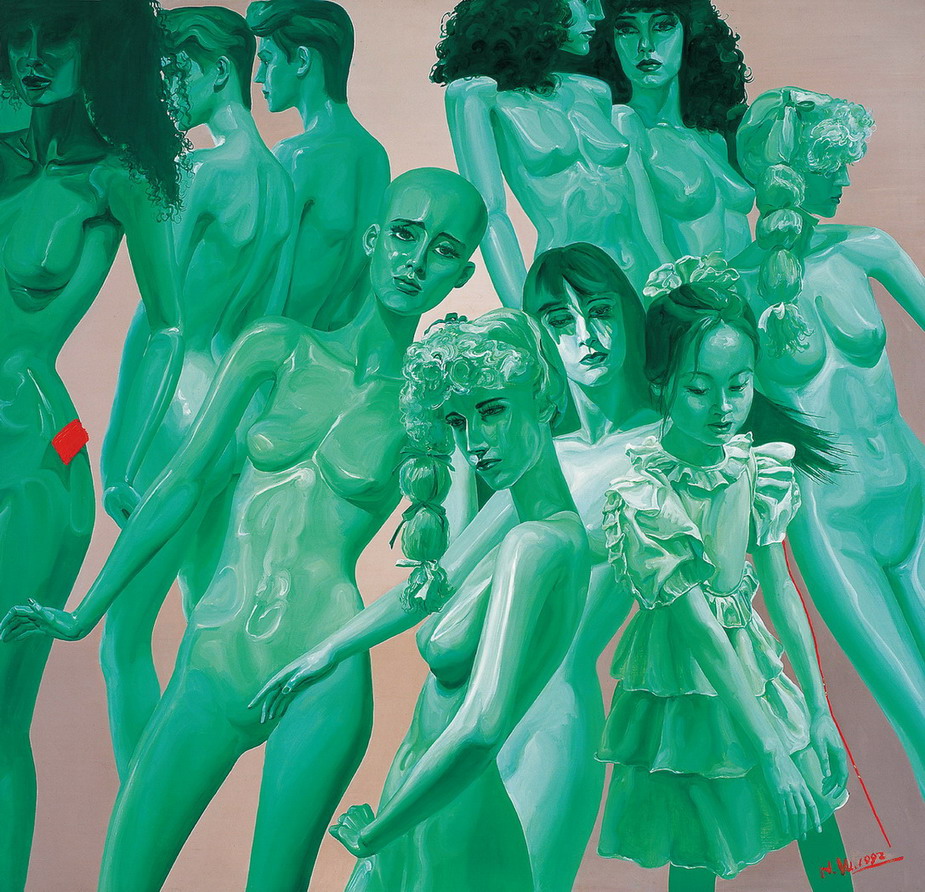
3. There are more shades of green than any other color. The color that spans the least number of shades is the color red. Artist Ellen Altfest exploits the full potential of green in many of her paintings, as you can see in this nuanced image.

Ellen Altfest

4. A green painting is the most difficult to color-correct when reproduced photographically. It is important to carefully check that your digital image matches your real-life painting.

5. Green paintings are the least marketable. This is the word on the street. However, no art dealer I have spoken with will go on the record as having difficulty in selling anything.

Inka Essenhigh
6. Green is the most atmospheric of any color. This seems to fly in the face of the use of blue to connote distance in Renaissance paintings, but on a sunny day, when the sky is blue, the air outside seems the clearest to me visually. There just isn’t a lot of “air” to paint.

I remember the day when I was nine years old when a tornado ripped down the main street of my town, passing only three blocks from my house. As the air raid sirens were blasting a disaster alarm, I noticed my mother was missing from the shelter of our basement. I found her on the front porch, enjoying the spectacle. The air was a satanic green as the wind picked up.

Yours very truly,
Hilary Harkness

Studio Shots: Adam LaMothe, Nicholas Borelli, Angela Gram

Adam LaMothe (Painting, Class of 2012):
"My current body of work explores embarrassment, vulnerability
and absurdity through a series of intimate portraits."

Nicholas Borelli (Painting, Class of 2012):
"In my current series I'm trying to channel Kafka and
Cronenberg to explore human/insect transformations."

Angela Gram (Painting, Class of 2012):
"My work addresses human decay and intends to challenge
this taboo through the aesthetics of nature."

Help this Gentle Lion find a Happy Home and WIN 2 Cocktail Tickets to Tribeca Ball!

James de Pasquale, Lion, 1983, Acrylic on canvas, 72 x 136 in.

Many years ago we inherited this gentle Lion. Though he is very quiet and doesn’t eat much, he’s a big guy and we know in our hearts that there is a happy home for him out there. Please help us place him a good home in a charitable organization, a children’s hospital or maybe a school. Cadogan Tate, our favorite transporters, will take him wherever he is set to go, whether it’s Kansas, Salt Lake City, Palm Springs or the Upper West Side.

So we invite you to participate in a contest
to find a place where he can bring joy to others, too.
  1. Recipient MUST be a charitable organization, a children's hospital or a school (documentation must be provided) in the United States
  2. Contestants must show proof of approval from the receiving institution and provide a contact name and info
  3. The winning location will be chosen by the Academy and Cadogan Tate
  4. Recipient organizations are asked to send photo of ultimate location – before and after installation
  5. The winning contestant will receive 2 COCKTAIL TICKETS to the Academy’s upcoming Tribeca Ball on April 4, 2011
Contest to run March 1 – 31, 2011.
EMAIL ALL ENTRIES TO CONTEST@NYAA.EDU

Thank you and good luck!

Distinguish Yourself as an Artist by Painting from Life

The New York Academy of Art is pleased to share a new note by artist Hilary Harkness. "Notes from Studio Lockdown" is Hilary's blog with us as she prepares for her upcoming exhibition in May at Mary Boone Gallery in New York City. Follow her on this blog for exclusive views of her studio practice!


Dear friends,

You might wonder why an artist like me, who paints imaginary scenarios, is a proponent of painting from life, but I do it quite regularly. I travel to significant locations to do preliminary studies from life to get a handle on how color behaves, I buy relevant props to paint to add touches of verite, and sometimes even ask my girlfriend to throw a right hook so I can depict a boxer convincingly.

On the other hand, I often make up color schemes that I use in a systematic fashion to make my scenarios seem real. For instance, I know blue light will create cool highlights and therefore the objects will cast warm shadows. I use the rule that highlights are sharper on shiny objects. I scour the works of Fragonard to try to guess at his color system. In addition, the journals of Eugene Delacroix are very useful because he described the exact pigments he used to create reflected light in the shadows of flesh.

Hopper
But here are three examples of why painting from life, at least at some point in your process, is unbeatable. In looking at the following paintings, let’s ask: Why is her face green?

Hopper, detail


A girl looks out from the shadows of her tenement window onto a bright snowy backyard scene. Looking closely, we see that her face has indeed been created using green paint. But in the context of the painting, it is obvious her face is not actually green. No color system in itself tells us why this use of green rings true. We can see from her rosy cheeks that her face is pinkish. If the local color of her face was yellow, then a reflected blue light from the snow could combine with that to make her appear greenish. Maybe the room she is in is green, but she is standing too close to the window for it to affect the appearance of her face. Perhaps the green skin is meant to make her cheeks seem an even more feverish bright red be contrast. The dullness of the green pigment (perhaps the earth color terre verte) makes her cheeks seem to actually radiate heat and light. It adds pathos: is this girl too sick to go out and play? Is she experiencing vicarious delight despite being at death’s door? The use of green in this girl’s face makes this painting transcend any illustration of a snowy scene, and I think this transcendence has sprung from years of observational painting.

Van Gogh
You would have to go to MoMA yourself to see that Vincent van Gogh uses green pigment in the flesh of his subject Joseph Roulin.Great painters don’t simply depict exactly what their eyes see like they are photographic machines; there is interplay between the artist and his subject, and the artist and his canvas.

Van Gogh has selected a limited palette and created a tight color envelope that allows certain greens to read as more neutral flesh-tones. In addition, the contrast of the even greener wallpaper behind Joseph Roulin pushes his face back toward a ruddy alcoholic complexion.

Nicole Eisenman


Nicole Eisenman has made many lovely paintings of scenes in nighttime beer gardens. She captures the conviviality of the moment, as well as the darker moments her characters could be experiencing. Eisenman is obviously a close observer of not only the unusual night-time lighting in this type of scene, but the varied emotions of the characters within them.

Yours very truly,
Hilary Harkness

Printmaxing!

by Aliene De Souza Howell (MFA 2011)

I started printmaking again last semester after years away from it.

Since taking the Narrative Printmaking Seminar, I started creating relief linocuts inspired from poetry. This acted as a significant catalyst in freeing up the imagery in my work. I felt I could get away with anything because of the graphic quality of the black and white and the finality of carving that lent a certain austerity to the image.

I’ve just started using animals as a lens to look at ideas of social practice and how, as humans, we’ve chosen to cultivate ourselves. I’ve always responded to the impact of life size work where you could really enter into the image and have always worked large in my paintings, so I thought I’d push my printmaking and began to work on a 36” x 60” image.

Printmaking instructor John Jacobsmeyer, Yi Cao, Post-Graduate
Teaching Assistant Jan Pecarca and Aliene set the press.

Due to its monstrous size, I needed assistance printing it. The press bed was maxed out and we even had to re-adjust it (a risky feat) and send the block back through the press a second time in order to print the entirety of the image. It worked out and I’ve just begun my second large print!

Pulling it off the press - a first look...

The linocut, finished!

Don't miss the last Open House! March 19, 2011

MFA OPEN HOUSE DATES


March 19th, 2011

**Attendees will have their application fee reduced from $80 to $60! Please click here to register.
The 2010-2011 Open House postcards feature recent graduate Tamiko Stump in the Academy printshop. (See post about the Academy's new Griffon Series I lithography press.) To request Open House postcards or electronic copies to distribute, please email admissions@nyaa.edu.